We saved the best for last: building a compelling narrative out of your exhibition that visitors connect with.
Following on the first two parts of this series on building digital exhibitions, the last covers a little bit of insight into the average online visitor, what they are most concerned about, and crafting narratives that are relevant to them.
Before we get to it, though, stay tuned next week for a very useful post from Exhibition Producer and egyptologist, Tessa Litecky (@litekysplit), from the American University in Cairo, on Tips for Creating Great Online Exhibitions. Coming to an inbox near you.
So then for an overview of the series so far:
- Getting Started
- Building your database
- Building a compelling narrative out of your exhibition (You are here)
- Tips for Creating Great Online Exhibitions
Example exhibition from our partners at Harvard’s Giza Project: https://giza.mused.org/
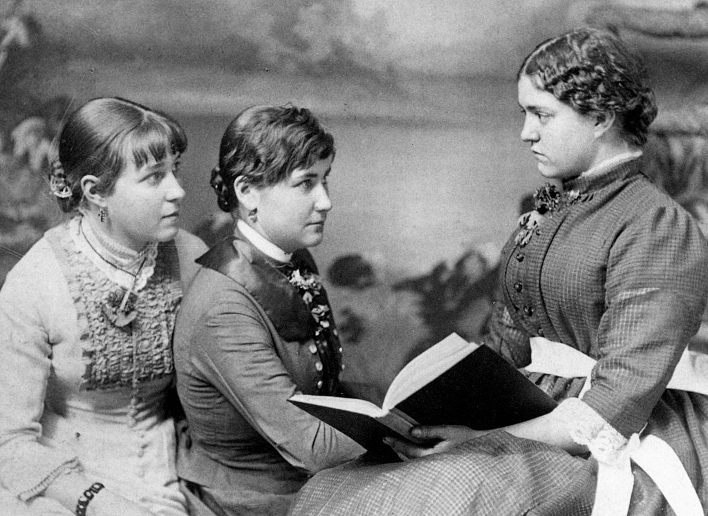
Creating a compelling narrative for your visitors
So you’ve got the idea for your exhibition and your database in-progress, your last, most creative task is ahead: authoring interactive multimedia stories just like you’re an investigative journalist at the New York Times. (Their year end reviews in visual storytelling never fail to inspire!)
Where to start? How do you write stories that your visitors will connect with and drive them to explore more of your exhibition and become a returning, lifelong learner of your collection?
In order to dig into what to write, it can help first to understand who your primary visitor is:
Who looks at online exhibitions?
So if you’re at a cultural institution and you’re creating content, particularly if you’re somewhere near to higher education, you may break down your priorities for your audience like this:
- Researchers
- Educators and students
- General public
For your narratives, your researchers may be more likely to be the experts that you interview rather than your readers, and classroom use of digital exhibitions will be covered in a post coming to your inbox soon, so I’ll focus in on #3, your general public audience, the most overlooked and under-appreciated of all!
The general public type user may very well be the type that loves exploring digital exhibitions and learning about new cultures on platforms like edX and Coursera, one that pays attention to websites like Google Arts & Culture, National Geographic, Hyperallergic, ArtNet, Atlas Obscura, and others. They might frequently search and talk about museums, cultural heritage, social justice, and virtual tours.
Think in their brain. What’s most interesting to them? What do they care about deeply? What can’t they get enough of? Not that you need to address these directly, but it can be a starting point for creating educational pathways into your collection. (They might watch things on History.com but be equally as suspect of certain shows there ??).
For example, in a wide survey of about 10 million people from the general public that visited some of our tours in 2020 during the pandemic shutdown, we were able to gather this basic information:
- ?? Primary languages were Spanish, then ?? English, with ?? Arabic following, and all other languages making up only about ~10% of visitors
- ? Shares primarily came from Facebook, then Twitter, and then news sites. Major influencers such as the Ministry of Tourism and Antiquities in Egypt and Dr. Sarah Parcak were some of the top accounts where visitors discovered the exhibitions
- ? A significant percentage of visitors loved remixing the virtual tours and building their own content on Youtube or other platforms with it
One report was particularly insightful:
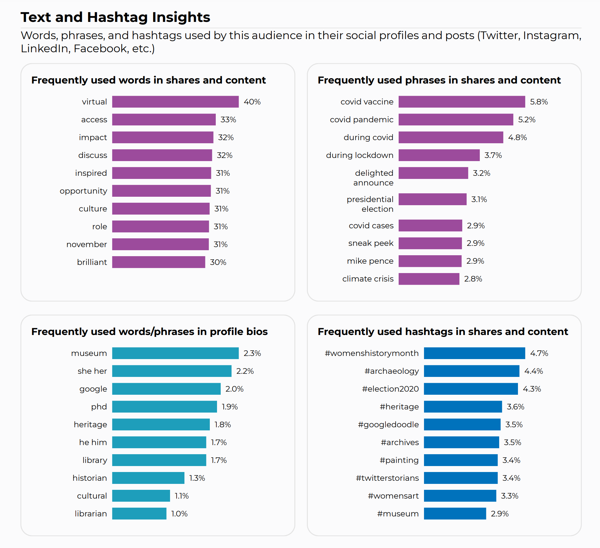
If you look at the words frequently used in the profile bios and the hashtags that were frequently shared, you can start to understand something about the interests of our general public visitors who may also likely be Ph. D. educated heritage, librarian, and museum workers that are non-researchers but still highly interested in learning about new subjects.
So instead of thinking of a vague “general public” as a third-tier priority for your exhibition, you might consider instead presenting your collections’ stories to your fellow albeit distant colleagues that are non-specialist in your field as a first-tier audience that’s already sympathetic and probably curious about your collection.
Crafting connection (and going personal)
“The best way to reach all people is to go to a personal story,” said Brenda Wong Aoki, an acclaimed playwright, storyteller and performer. “Everybody is a human being and everybody can relate on that level” (from an interview with the New York Times).
Now that you know your audience a bit more, you can start crafting a narrative to connect to them. If you’ve been on a first date in the last few years, you may already be familiar with the New York Times’s “36 questions to fall in love ?” game of 36 personal questions partners can ask each other to fall in love. Kind of in the same way, bringing a personal element to the historical, scientific, socio-political information of your collection can be a great way to build a connection with your visitor to get them to fall in love with your exhibition. (This is assuming you already have the historical narrative content covered.)
Let’s go back to our Queen Meresankh III demo exhibition: https://giza.mused.org/ Say I’ve planned a few stories out around the educational goals, including information about Egyptian religion and funerary customs, women at Giza, and stone-built mastaba, but something feels like it’s missing. Adding in a personal connection to Meresankh might include a study of her sarcophagus (in the Grand Egyptian Museum):
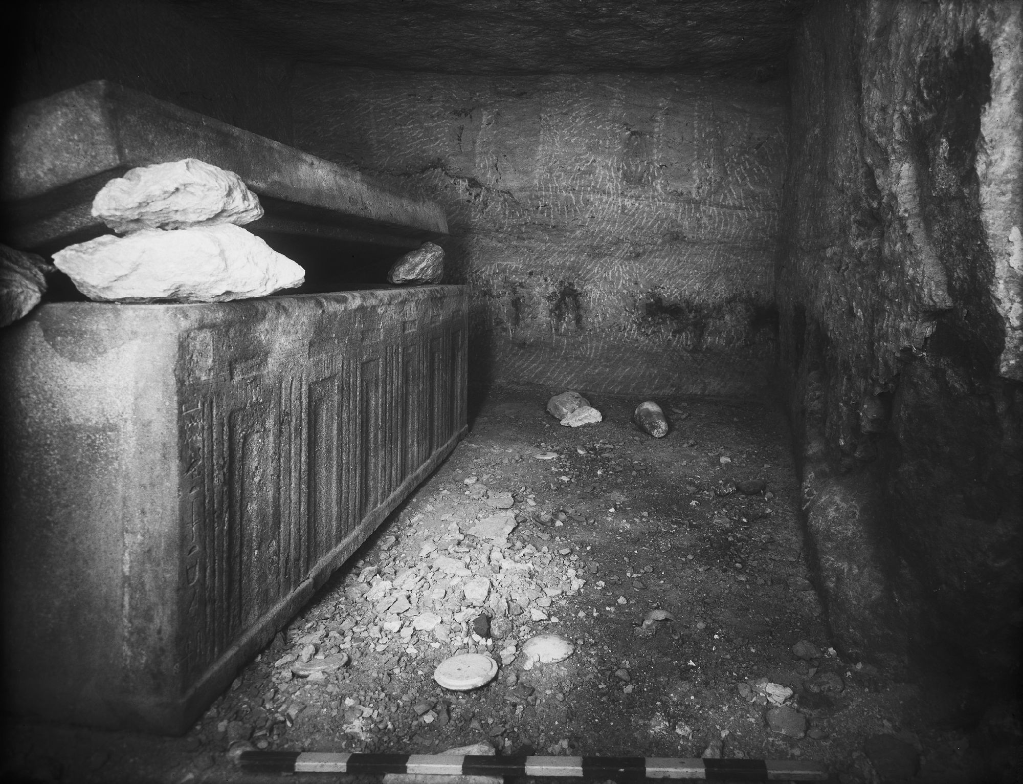
One of the saddest and most touching things about this tomb is that on the sarcophagus of Meresankh, we find the name of her mother, Hetepheres II, crossed out, and Meresankh written underneath. Did this mean that the sarcophagus that was intended for Hetepheres was given instead to Meresankh due to a sudden or unexpected loss?
The inscription on the sarcophagus reads “I gave the sarcophagus to my daughter – Meresankh, who was loved.”
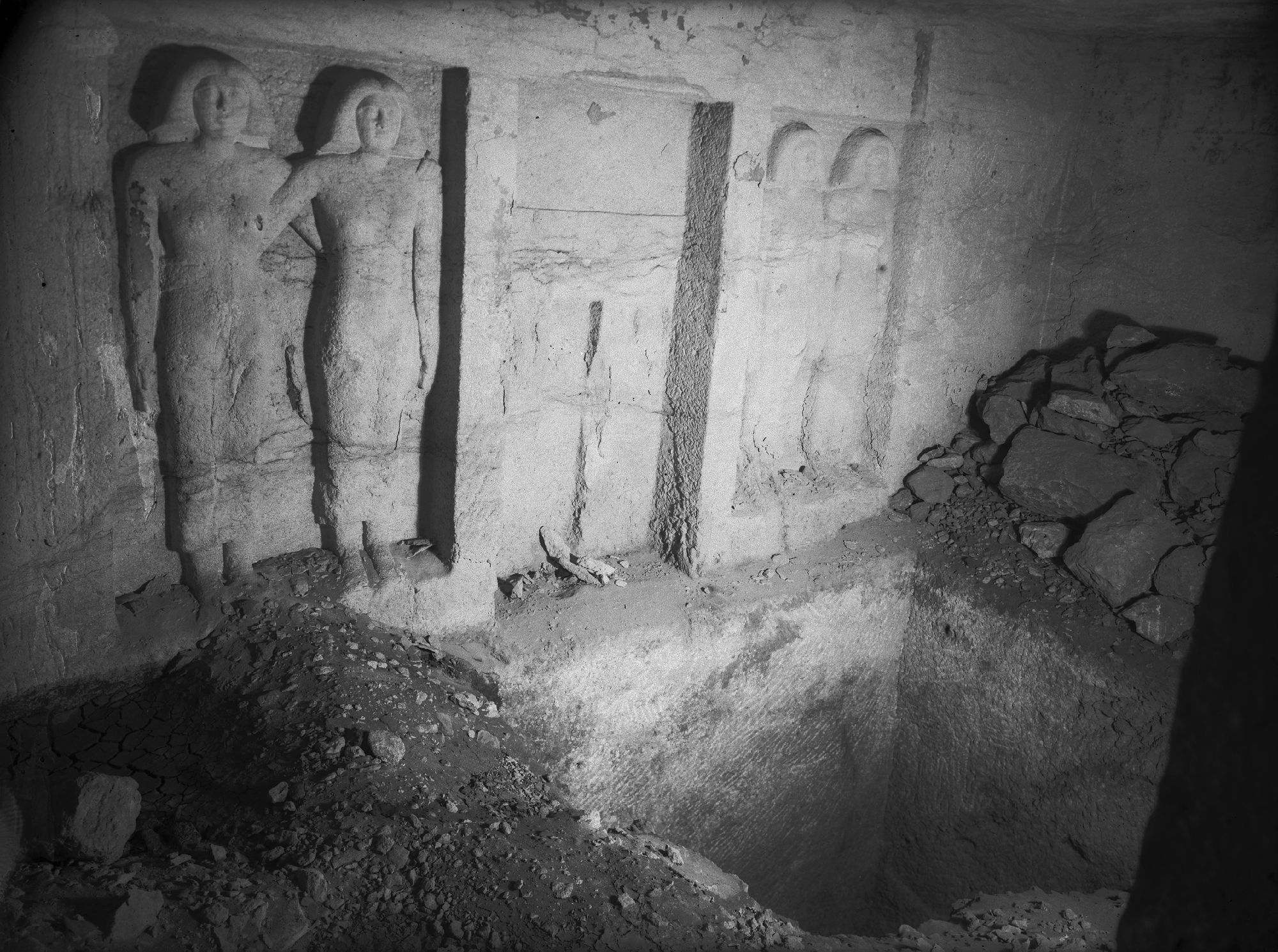
Compared with the intimacy and emotion in the rock-cut relief statues in Meresankh, the story of her tomb is deeply tragic and moving.
Another way of connecting to visitors may be to track and follow trends in social media and respond to them. There are many good strategies for this, and I particularly recommend joining the active Facebook community, Museum Social Media Managers for insights and creative inspiration.
How to publish and integrate media
If we head back to our Google Sheets database for our exhibition, adding Stories is easy.
I’m going to title my story about Meresankh’s sarcophagus “I gave the sarcophagus to my daughter – Meresankh, who was loved.” – the inscription that her mother left.
First, I create a new Google Doc in the folder called Stories that I made in the last post when I set things up (click that link if you’re having trouble finding it).
In my Stories folder, I now have a Google Doc where I’ll build out my story. For the purposes of this story, I’ll keep things pretty simple. You can see my story here: https://docs.google.com/document/d/1VjIrwN0wRsfQYuwGmlNo79EFkvqgAbwHLLt0O9JN3qQ/edit?usp=sharing
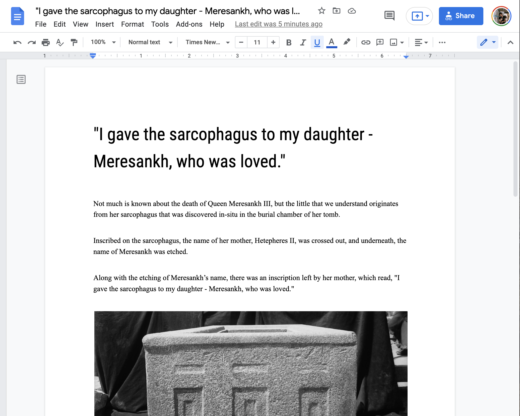
Along with the story, I added some elements of interactive media, including an embedded artifact, virtual tour, and simple file. More on this later.
Next, I go to my spreadsheet and navigate to the tab for the Stories sheet on the bottom left. I’ve added in my Story and the link to my Google Doc with my story in it here:
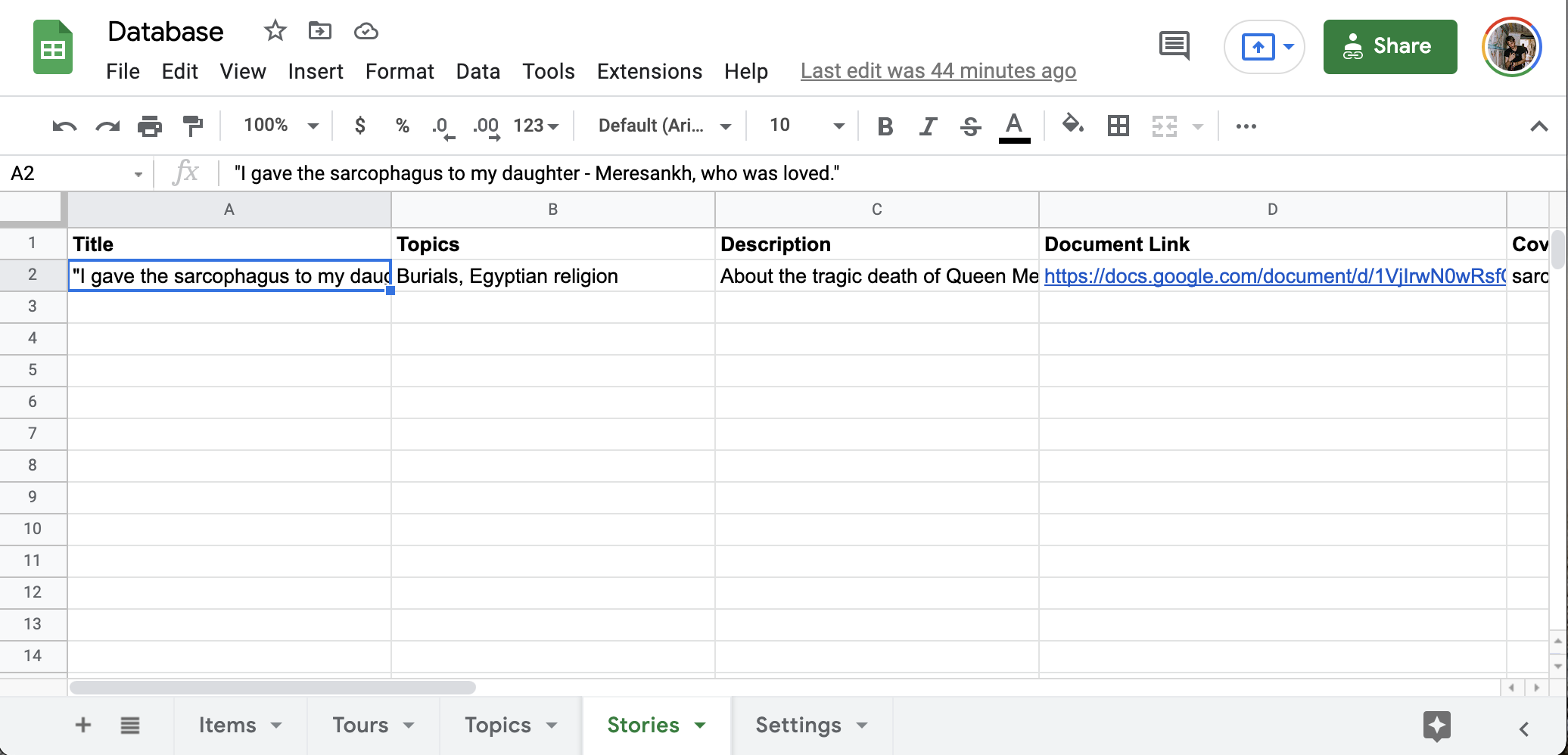
Make sure that your Google Doc with the story content is set to be publicly accessible to anyone with the link so our backend magic alchemical processes can integrate your content directly.
Finally, you can see the result of your story on your exhibition. My Meresankh sarcophagus story is now live at https://giza.mused.org/stories/83/i-gave-the-sarcophagus-to-my-daughter-meresankh-who-was-loved

If you visit the story, you’ll find that the image for the sarcophagus of Meresankh is linked directly to the Artifact record through the backend system recognizing that the item you mentioned in your story is the item in your database. Similarly, there’s something called a short-code for the virtual tour that looks like this:

This shortcode is transformed into the full embedded virtual tour of the tomb in the live story.
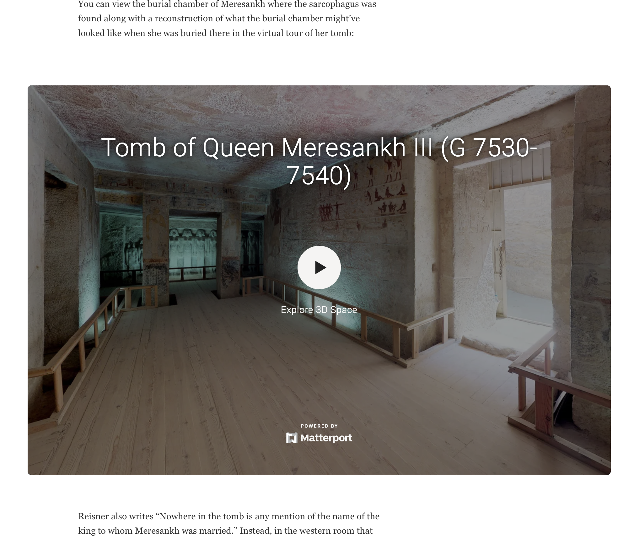
A full rundown on these shortcodes is coming in a future post.
Finally, where you might want to embed a separate image file that’s not related to any of the items in your database, you can simply upload the file in your Google Doc normally, and it will be added to your Story without linking to an Item.
Audio/Video, Timelines, Annotations, and Questions
The sky is the limit for the other media integrations that you might want to add. Check out a few of these other examples for interactivity that you can add to your Stories.
Timelines with Timeline.js: on the Saint Catherine’s exhibition, a timeline describes the history of the monastery from the 3rd Century AD to modern day:
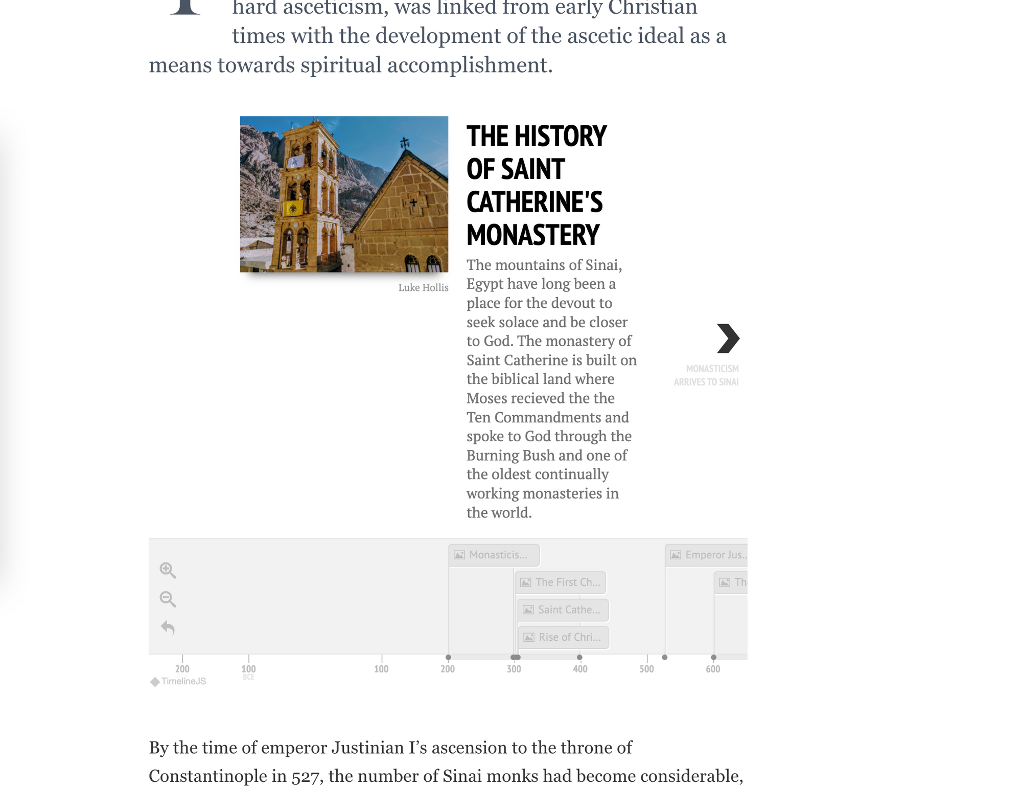
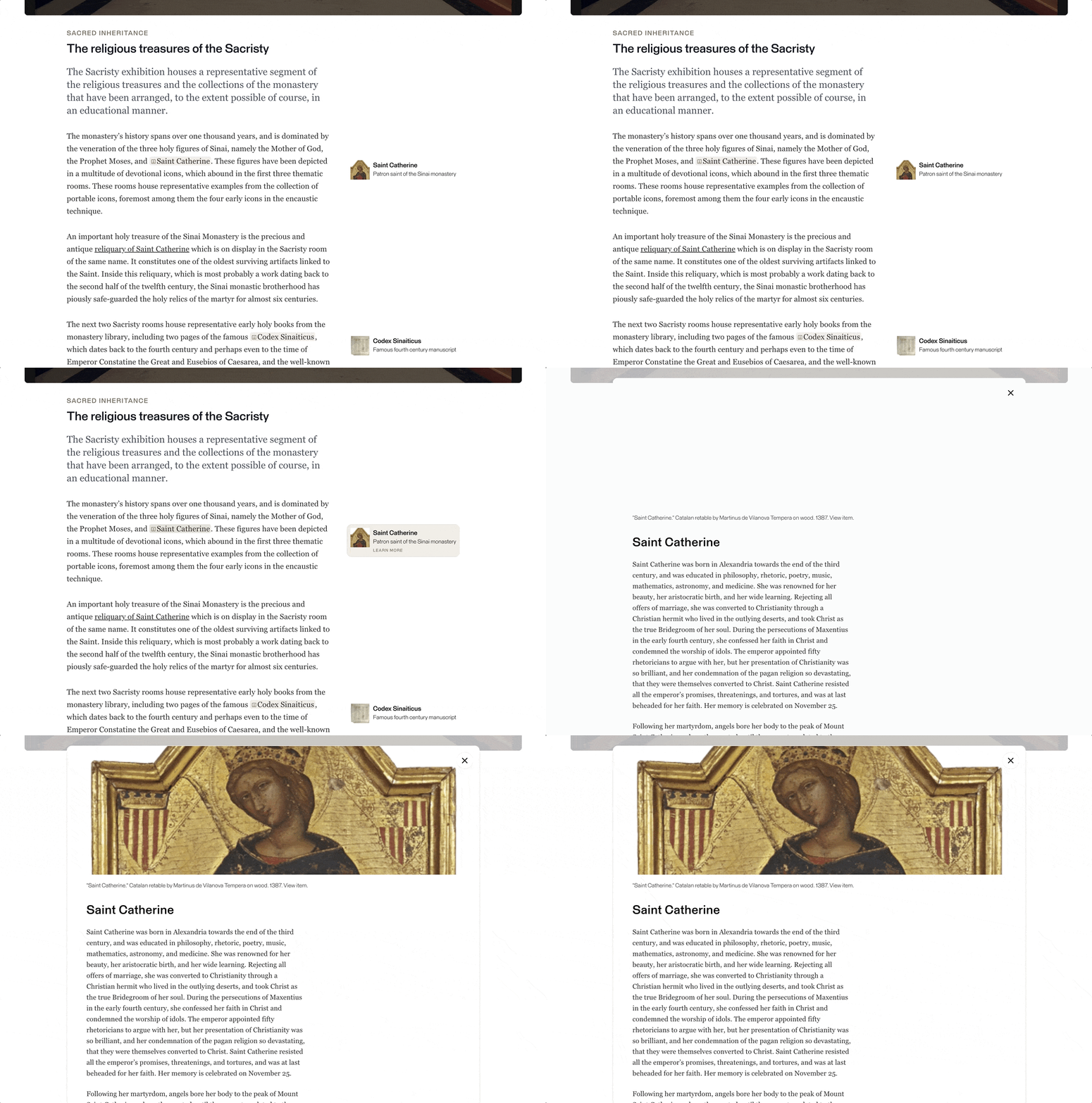
Annotations: Annotations offer useful reference information in a visual format that don’t distract from the main narrative. You can see these in action in the St. Catherine’s exhibition as well:
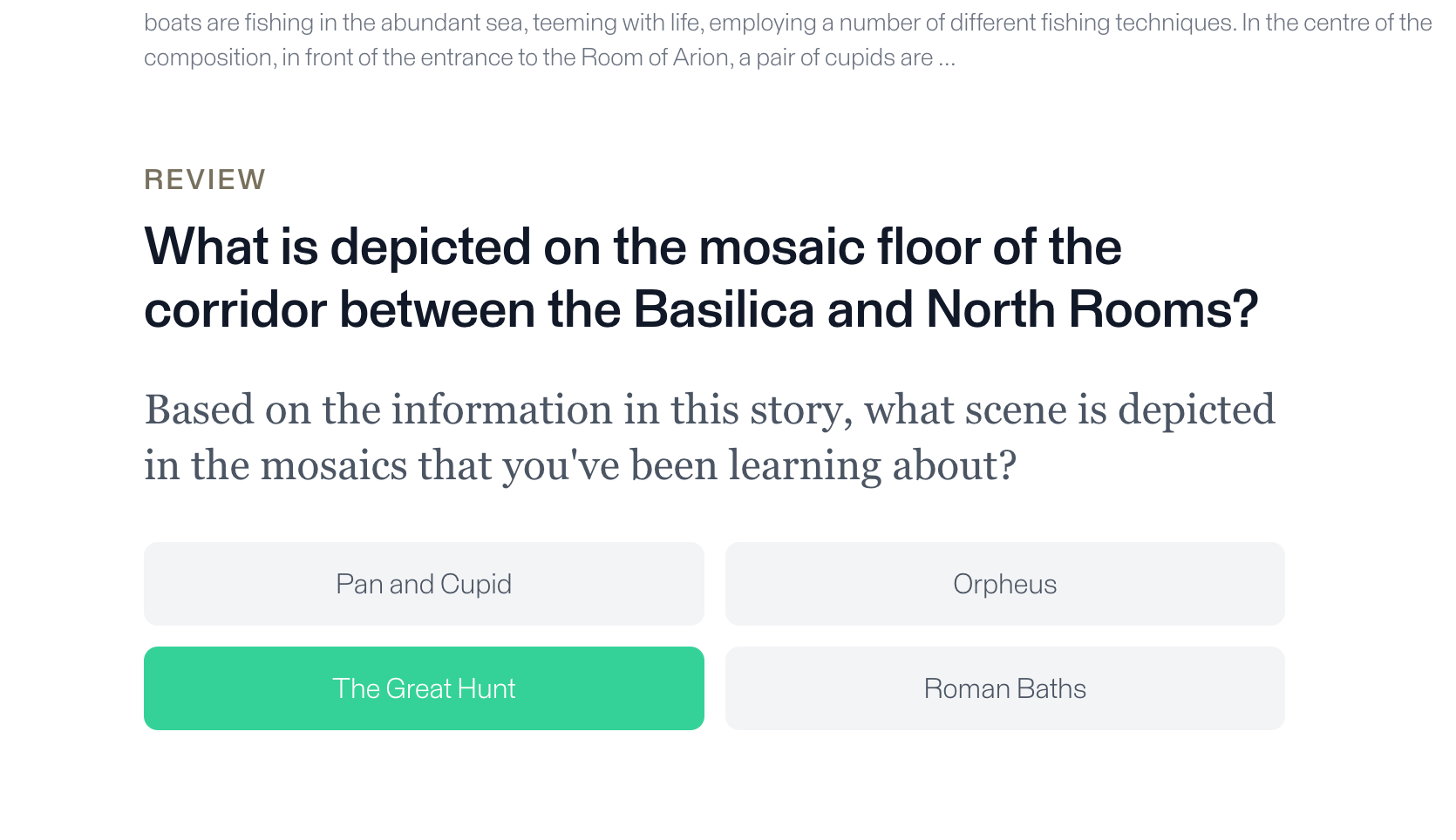
Questions: if you have specific learning goals or other educational programming that you need to add to your stories, you can add multiple choice questions to test reader’s knowledge and keep them engaged. An example is on a story about Roman mosaics in the Villa Romana exhibition:
Other exhibitions that inspire us
In closing, and to feature other exhibitions that inspire us and give new creative ideas for storytelling, check out the “Willi Smith Street Couture” exhibition from the Cooper Hewitt, Smithsonian Design Museum.
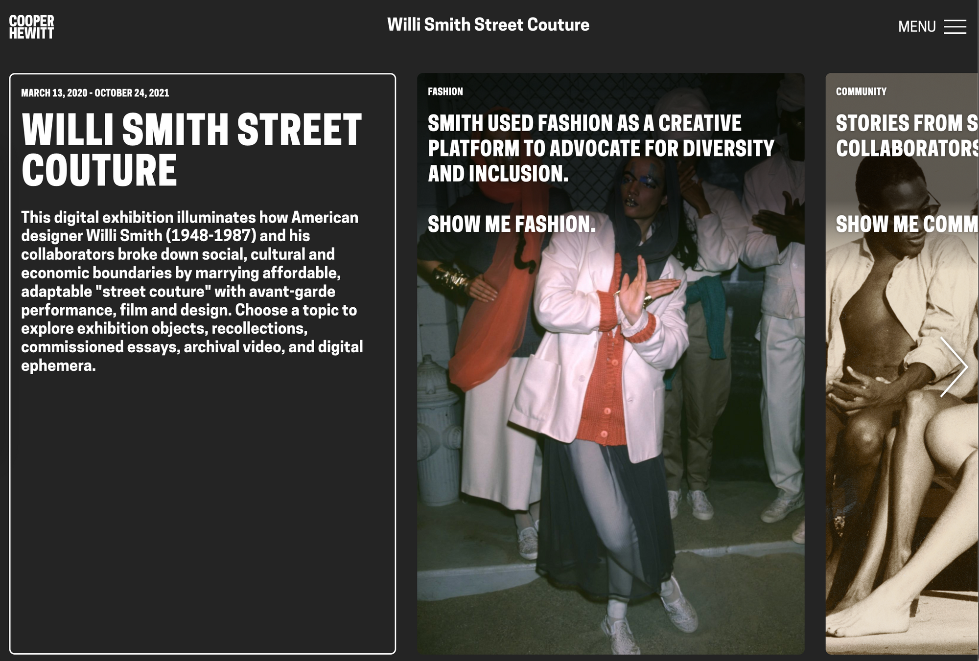
Link to the exhibition: https://exhibitions.cooperhewitt.org/willismith/
This is the first exhibition on the Cooper Hewitt’s new digital exhibition platform that they just launched.
Our Willi Smith exhib of 2021 was a first—now, to begin to celebrate #BlackHistoryMonth, we proudly launch another first: the Willi Smith Street Couture Digital Exhibition—our first exhib for our new platform that redesigns the way exhibs are experienced https://t.co/hJsq6WUDr2 pic.twitter.com/Efnoavawhg
— Cooper Hewitt (@cooperhewitt) February 1, 2022
There’s a lot to love in this new exhibition platform created for the museum by the Brooklyn creative agency, Linked by Air. Some of the best pieces that demonstrate a deep understanding of their users are a very useful “Your Journey so Far” panel and row of navigation buttons at the bottom of the page, to make the browsing experience more friendly for visitors on their mobile phones.
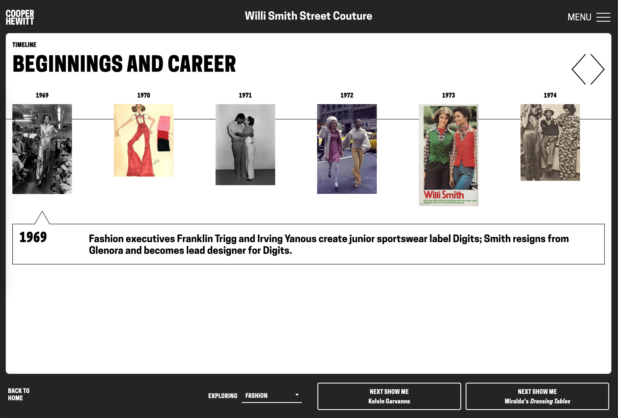
Be sure to check out the interactive timeline of Willi’s life also that brings the whole exhibition together: https://exhibitions.cooperhewitt.org/willismith/beginnings-and-career/
Keep reading Part #4 of the series, Tips for Creating Great Online Exhibitions.
Overview of the series so far:
- Getting Started
- Building your database
- Building a compelling narrative out of your exhibition (You are here)
- Tips for Creating Great Online Exhibitions
Example exhibition from our partners at Harvard’s Giza Project: https://giza.mused.org/
That’s all for now, GLAM-orous people! Please respond with comments about your own experiences and what’s worked for you. And this article will be updated regularly with more resources and examples as they emerge.
If this article was useful to you or inspiring in any way, please sign up ✨ by entering your email ? at the bottom of this page, and more fascinating winged words composing GLAM-tech blog posts will arrive to your inbox.



Pingback: Tips for Creating Great Online Exhibitions – Mused