If you’ve been following the three part series on how to build a digital exhibition, you’ve already determined your target audience(s) and identified key themes you want to address with your stories. With that in mind, it’s now time to consider exactly how you want to construct your content. I’ve created several digital exhibitions on Mused and Google Arts & Culture, and, along the way, I’ve picked up a few tips on creating engaging, dynamic, impactful, and informative content.
A digital exhibition is a unique type of media: It’s not simply an online copy of a physical exhibition but a format that incorporates elements of museum curation, storytelling, and web writing, all wrapped up in a ball of technology.
If you have a background in one of these areas, you already have a head start. This guide will help you translate your skills into creating great online exhibitions that people will want to tell their friends about. As a note, because this term is not so well-defined, I’m talking about digital exhibitions as a selection of online content (stories, articles, virtual tours, etc.) based on a collection of materials.
To get oriented with this guide, here’s an overview of the series so far:
- Getting Started
- Building your database
- Building a compelling narrative out of your exhibition
- Tips for Creating Great Online Exhibitions (You are here)
Example exhibition from our partners at Harvard’s Giza Project: https://giza.mused.org/
First, the Challenges
Attention Span (or lack thereof)
It comes as no surprise that the digital age corresponds with “the most distracted time in human history.” In fact, an infamous report from Microsoft claimed that humans today have a shorter attention span than goldfish.
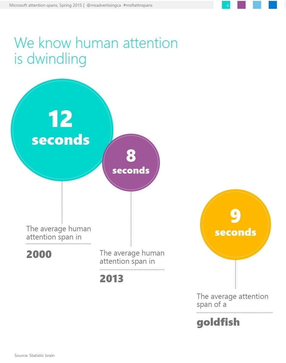
In addition to our limited attention span, users read digital material differently than print. Countless studies have shown that users don’t even read online; they skim. This means that the way you organize and present your content is all the more important to keep your reader’s attention.
Content, Content Everywhere
With a wealth of information constantly at our fingertips, frankly, there’s a lot of competition out there, and your content can easily get lost in the shuffle. However, the good news is that the digital space is the perfect place for innovation, experimentation, and creativity. Don’t let your content become generic. How can you stand out?
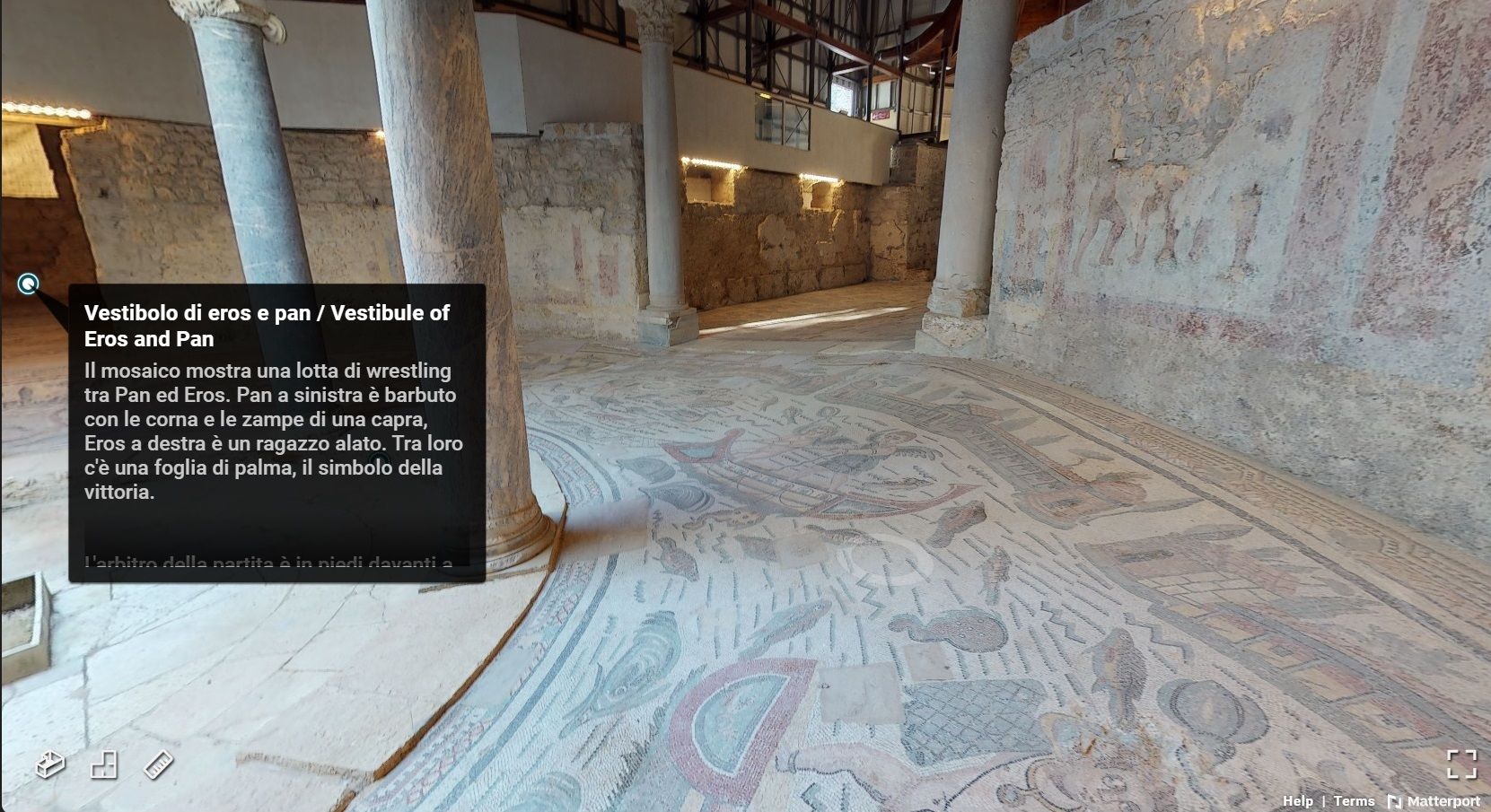
At Mused, one of the tactics we’ve embraced is using virtual tours and recreating spaces. The tours are an engaging way to present information and give direct access to people who cannot visit the physical site. While virtual tours have become more common online, we are continually exploring making them more user-friendly and customizable for a unique online experience.
Knowing your Audience
Luke Hollis wrote an earlier blog post that took a look at what kind of people engage with digital exhibitions by GLAMs. Make sure you have this target audience in mind as you create stories and then…see if it works! Track who comes to the site and for how long, which stories are the most popular, and if the content is being shared on social media. All this will help you continually redefine and better understand your readers.
Writing Your Content
Keep it short
One of the most simple and important guidelines is to keep the writing short. This point is often overlooked, but it means the difference between keeping your reader or losing them. Think about the length of your story, of each section or block of text, and of each sentence. (See, didn’t I do a good job in this section!?)
Keep it accessible
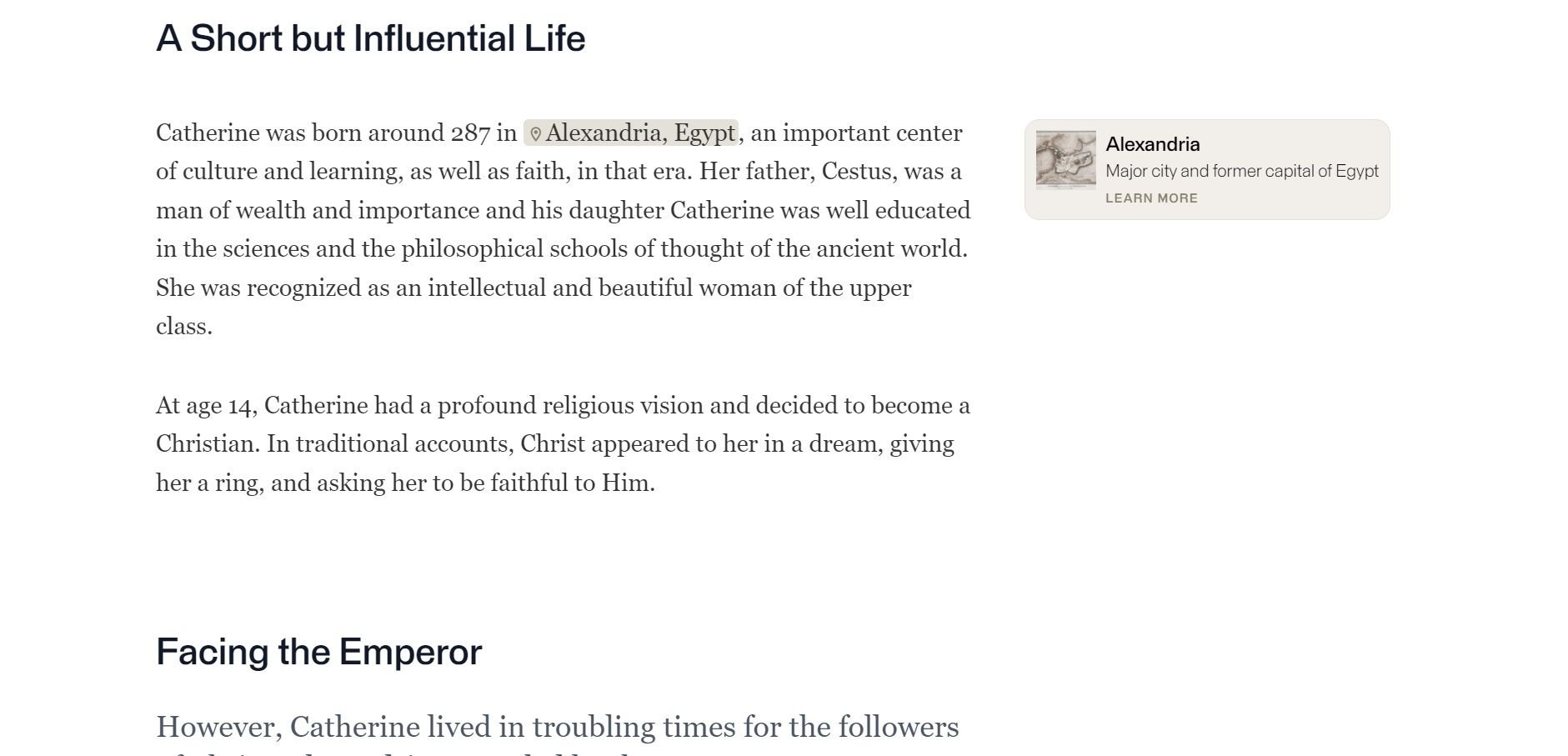
While your audience may have some prior knowledge about the subject matter, you want to make the writing broadly accessible. When writing online content, I like to have a specific person in mind (real or imaginary). For me, it’s my smart 10-year-old nephew. As I’m writing and editing, I continually ask myself, is this something he would understand? Inevitably there may be advanced vocabulary as we dive into more specific and technical information, but try your best to keep it to a minimum and briefly explain unfamiliar or specialized terms. Mused has the option of adding informational annotation tabs in the margins so users can read more about specific terminology or historical figures and places. Also, keep in mind how your visual content can aid the audience in understanding more complex ideas (discussed more below).
Make use of your (sub)titles
Finding the right title for your story or exhibition is vital. A great title should be short, creative, and catchy. Don’t worry if you can’t include all the information about your topic in the title; just give the readers a taste. Try to avoid jargon, uncommon words or phrases, and passive voice. Unlike the body of your story, this is the place where you can embrace clichés, cultural references, and humor!
Because we know that users tend to scan websites, subtitles can be a good tool to guide your reader through the content and keep them reading for longer. Try to keep each section short and focused on a single topic. The subtitles will allow you to make quick transitions between subjects without losing your reader.
Correct grammar and consistency
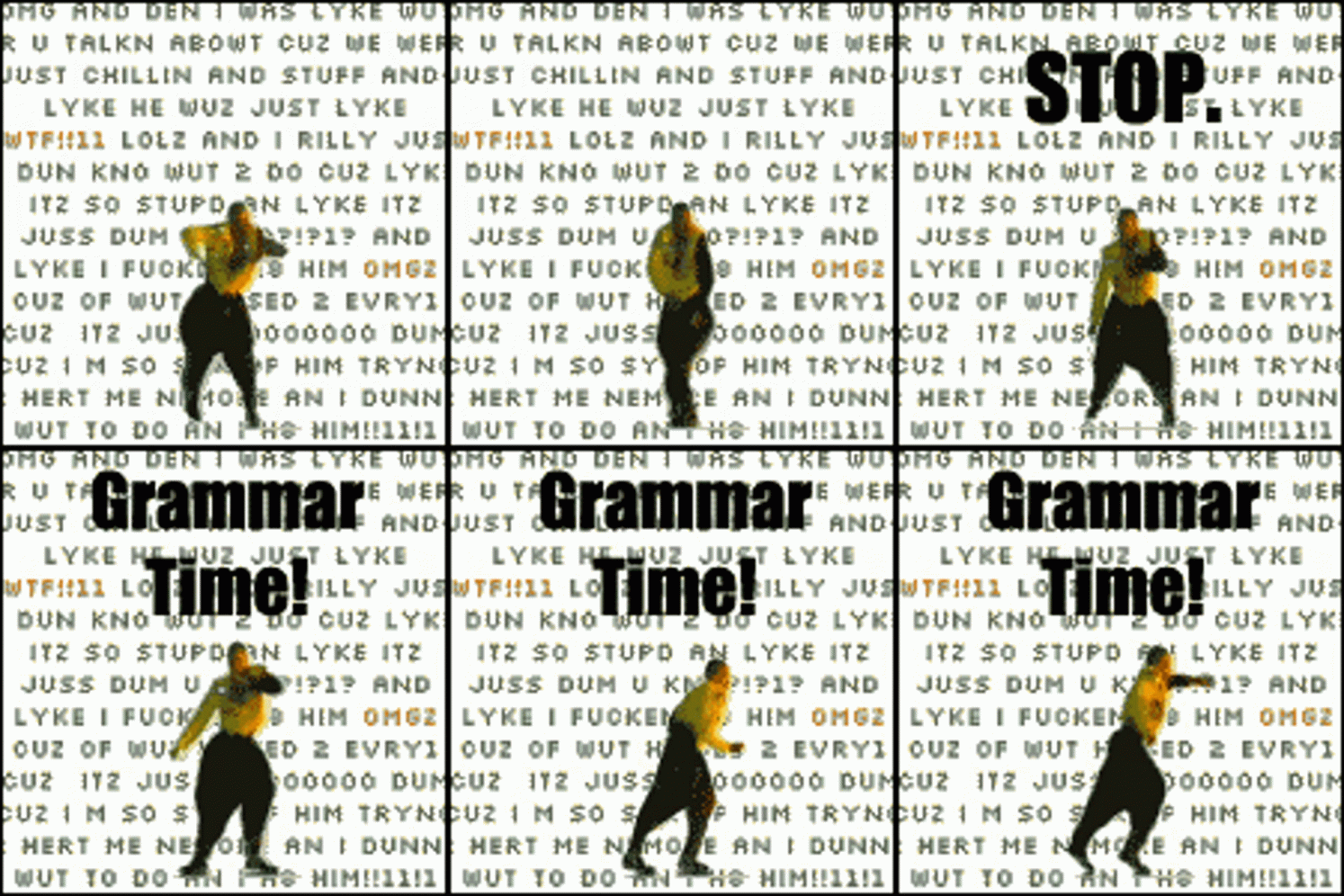
Even the best content, can be riuned by distracting grammar-errors. See? The first draft of your text is for writing everything down and expressing all your ideas. The second draft is about editing content, length, and especially grammar. When you finish writing, read it again, read it out loud, have your mom read it, just make sure it’s correct and easy to understand.
Some platforms have a style guide, which sets out preferences for things like the spelling of proper nouns or slang words, paragraph formatting, or the use of the passive voice. Here at Mused, we have a variety of both in-house and user-created content and are working on creating a style guide to act as a point of reference.
However, the most important rule for your content is consistency. For example, if you use an Oxford comma once, make sure to use it throughout your text. Don’t use the British spelling of “colour” but the American spelling of “flavor.” There are lots of free online resources to improve our writing; use them! Try sites like the Hemmingway App, Grammarly, WordTune, and any one of the many thesauri online.
Now for the Content
Share the most important and interesting information
It may be tempting to share all the information you can about your collection, but readers will be more responsive and engaged when not overwhelmed with excessive facts. You must find a balance between sharing enough context to understand the materials without overloading the reader. Ask yourself: is this essential information? Or can my reader understand the point without it? You’re trying to communicate an idea to your reader, not make them an expert on the topic.
Make sure your writing includes both informative facts, which give the reader a greater understanding of your collection, and interesting facts, which will help contextualize your material and ensure that your reader will kill it at their next trivia night.
Balance your text and visuals
Most of the tips thus far have focused on text, but visuals can be an excellent way to communicate information and re-engage readers whose attention has begun to drift.

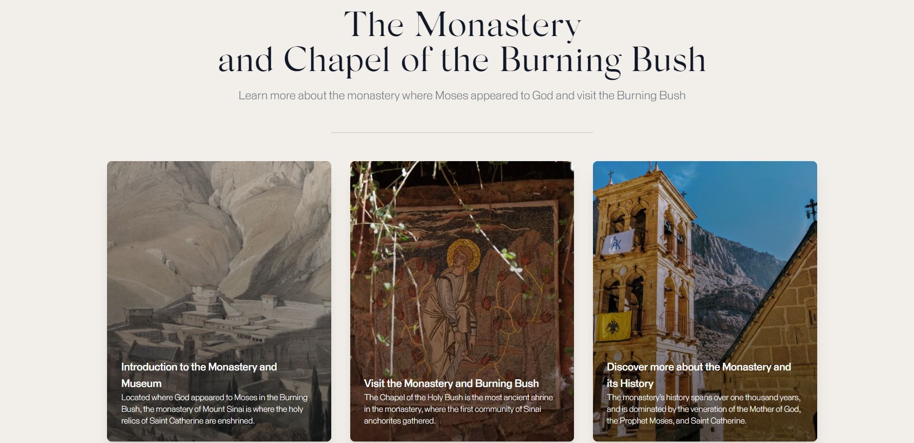
I’m not talking just about fun pictures, but also maps, 3D models, virtual tours, embedded videos, and even audio snippets. With Mused, you can also add timelines, annotations, and quiz questions (see this blog post, for examples). When you start deciding on your exhibition themes, keep in mind which audiovisual materials you already have available and which can be created for your exhibition.
Variety is the Spice of Life!
If you have the time and resources to create a digital exhibition, or series of stories, it’s wise to use several formats that appeal to diverse audiences. This might include virtual tours, in-depth articles, stories focused on a single artwork, interactive maps, lesson plans, first-person narratives, or “listicles.”
Variety is not only important for the formats you choose but also the content you write. For example, a museum may create stories on the life of an artist or historical art movement but also highlight more contemporary issues, like the work of their conservation team.
Finally, the “so what”?
My father was an English teacher for many years, and one question he always posed to his students as they tackled writing their first essay was: so what? Ok, you’ve told me about the causes of the Cold War or described the mosaics of a Roman villa, but what does that matter to me? You have to make people care about your collection, and you have to make it explicit. This means that you can’t just rattle off facts; it’s also your job to show readers how this information relates to their own life. If you finish a story and can’t answer “so what?” take a step back and rethink your approach.
Congratulations on making it this far to complete the series. Here’s an overview of the posts:
- Getting Started
- Building your database
- Building a compelling narrative out of your exhibition
- Tips for Creating Great Online Exhibitions (You are here)
Example exhibition from our partners at Harvard’s Giza Project: https://giza.mused.org/
If you have questions, please write in at the comments, or email us directly at [email protected].
And if this guide has been useful to you, consider entering your email address at the bottom of the page to subscribe to more updates from Mused as we build digital exhibition software for galleries, libraries, archives, and museums around the world.
1 Comment
Comments are closed.



Pingback: How to build a digital exhibition for your museum or heritage site in 2022: Telling your collection’s story, part 3 of 3 – Mused